kids camp identity and workshops
(01)
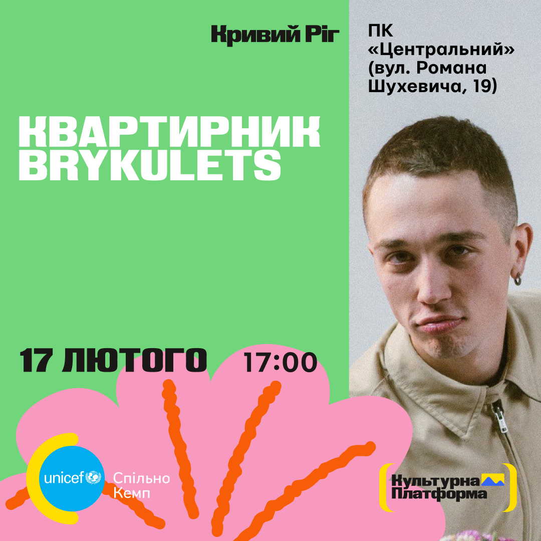
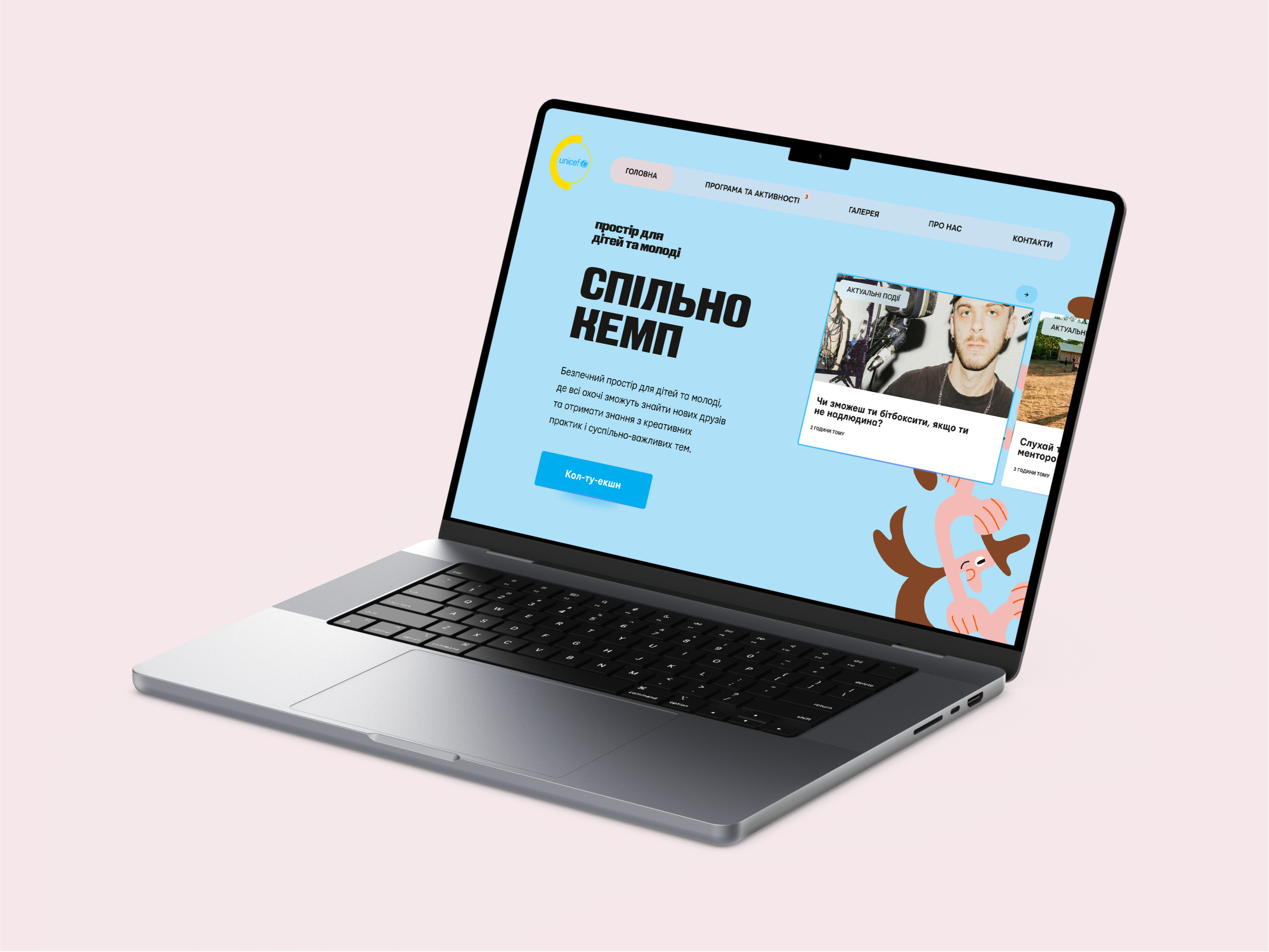
Workshops for Ukrainian children, teaching them how to create design images; Design assets for a safe space managed by an NGO.
Published
2024
Copyright
UNICEF Ukraine
Illustrations by Yevhen Velychev
Illustrations by Yevhen Velychev
Objective
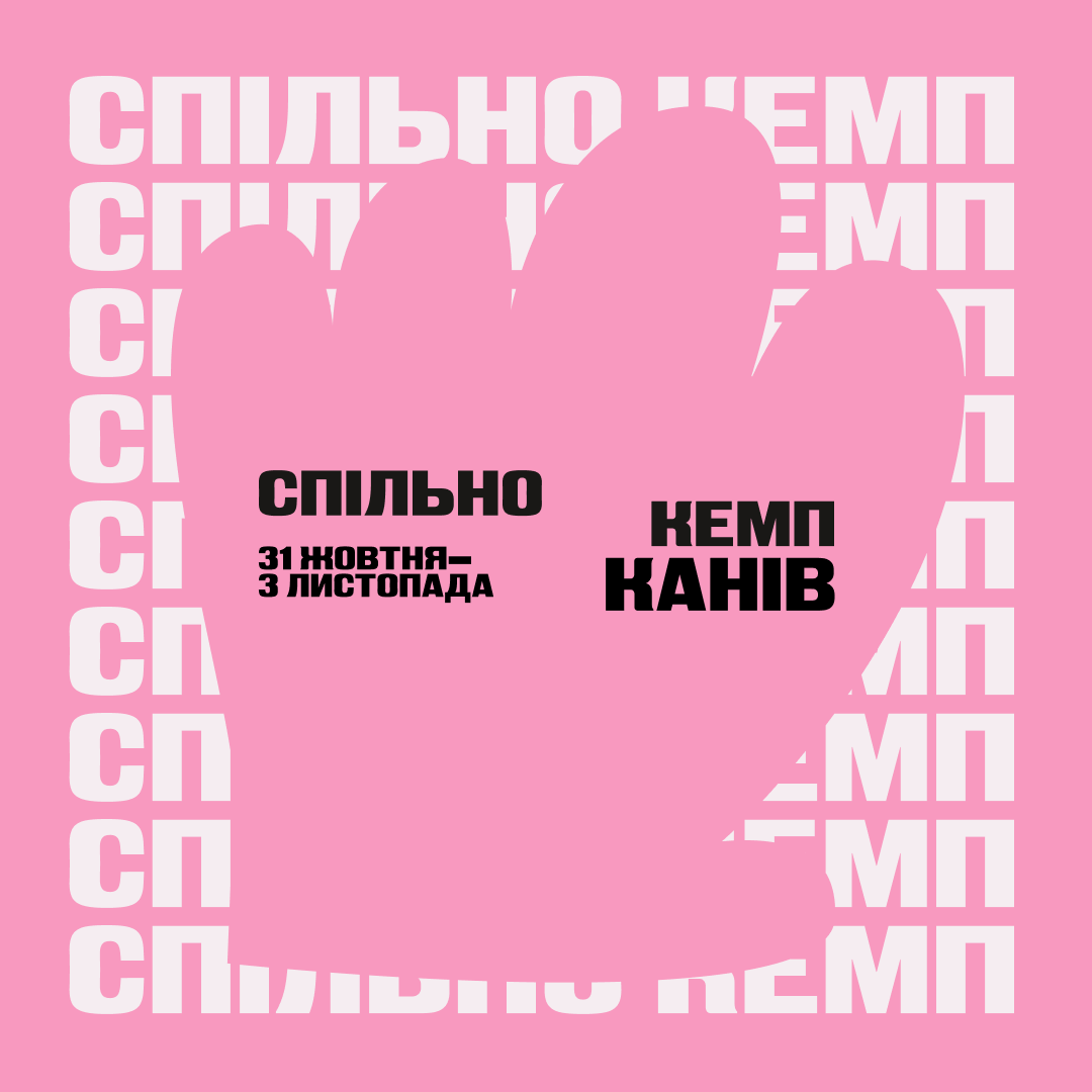
The primary objective of the project is to establish a unified style for the youth summer camp. Despite the ongoing war, the camp is dedicated to restoring the joys of childhood to children and offering opportunities for young people to pursue lucrative careers in the creative economy. This public association, with the backing of the United Nations Children's Fund (UNICEF) in Ukraine, is engaged in projects focused on social and behavioral change as well as psychosocial support.
Problem Statement
Due to the war, Ukrainian children have limited access to quality education. Therefore, the focus of the NGO's mission was on one of the 17 UN Sustainable Development Goals, which is to ensure inclusive, equitable, and quality education and to promote lifelong learning opportunities for children.
Challange
Time and dynamism were major challenges I faced. As a young team, we lacked a unified task system, which led to poor planning and unrealistic tasks at different levels. To address this, we operated as a small agency within the larger team, taking on additional roles to prioritize design tasks from various stakeholders in different styles. It was crucial to free up time for my own initiatives and ideas within the project. This experience taught me that different team cultures and unclear roles can lead to misunderstandings and conflicts, draining a lot of energy. However, open and honest communication with the team, coupled with offering solutions, proved to be the way forward.
Approach
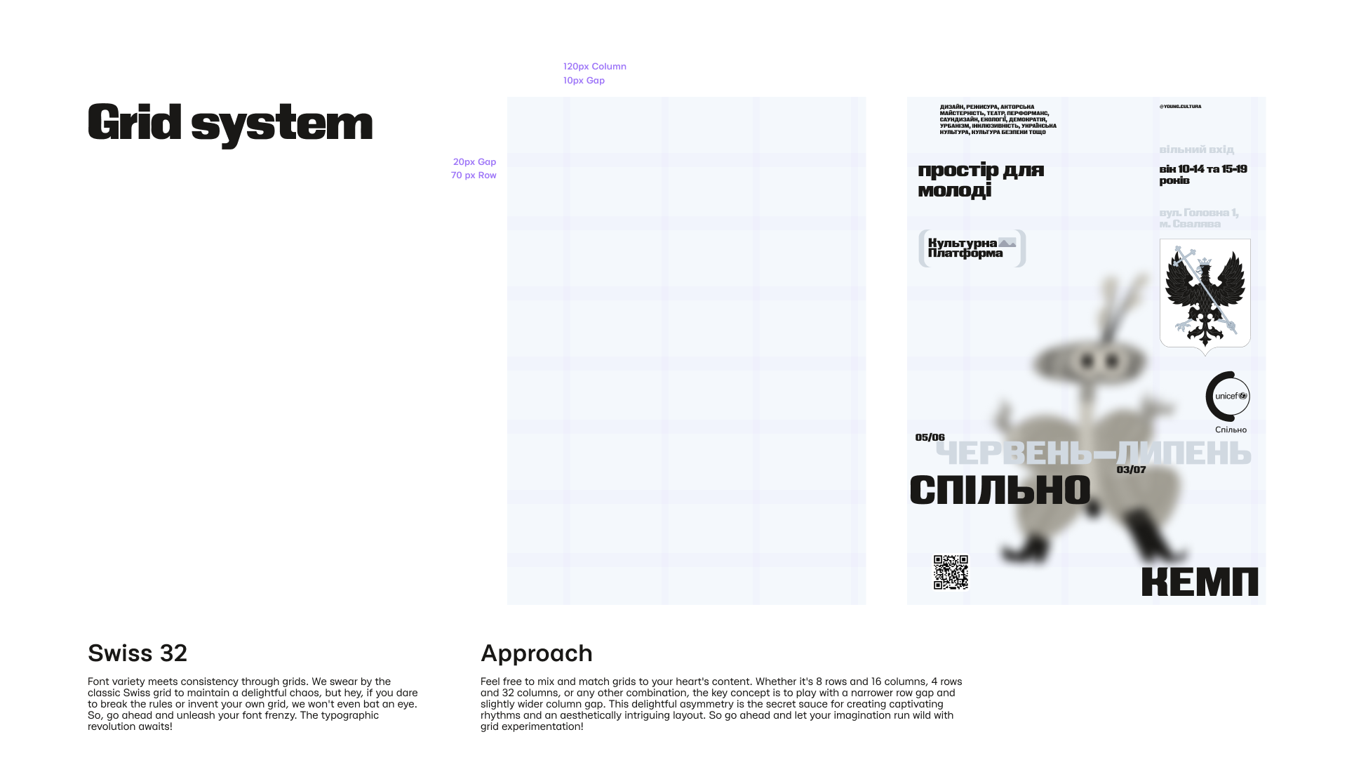
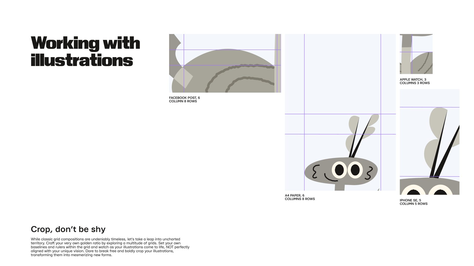
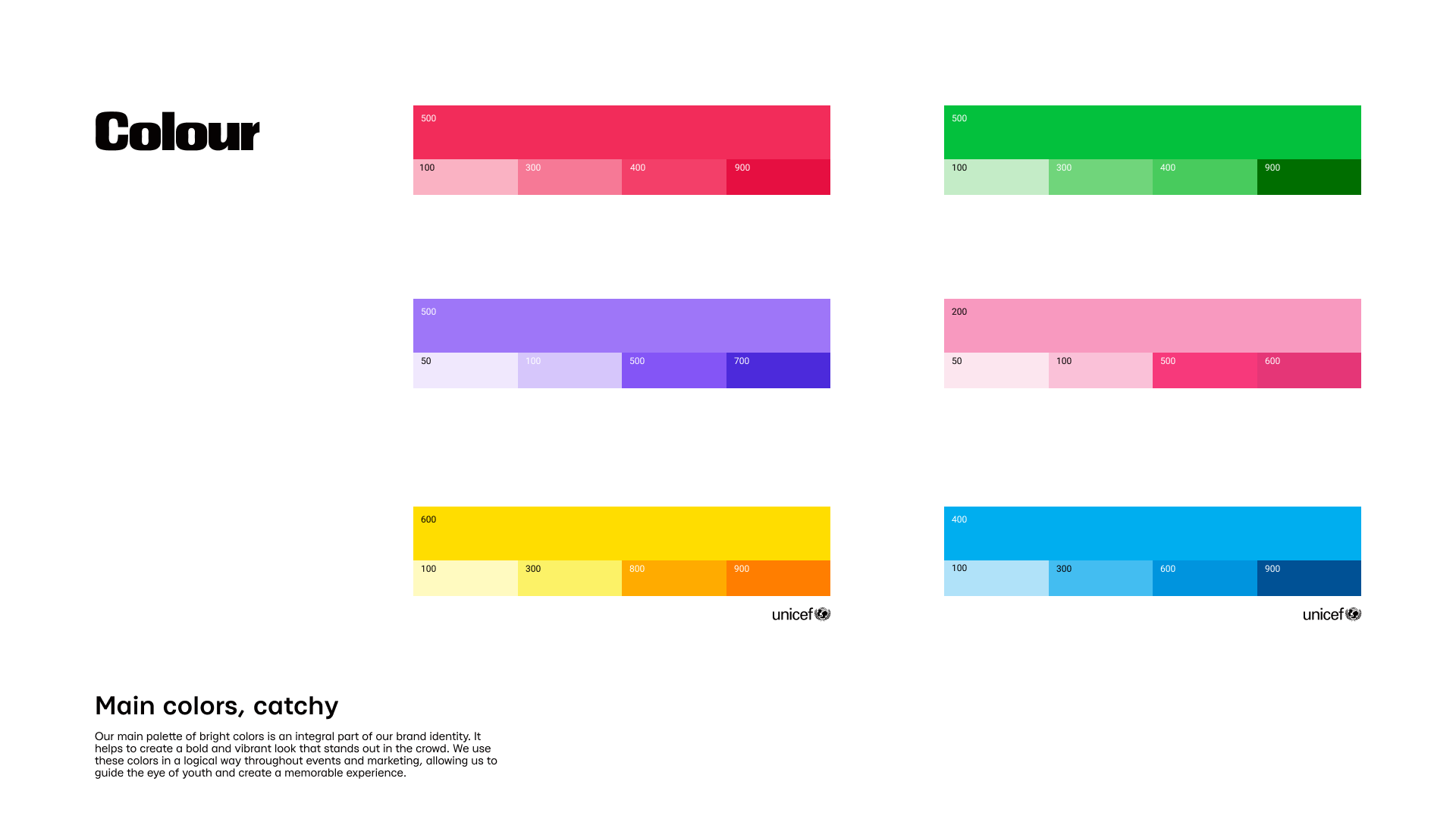
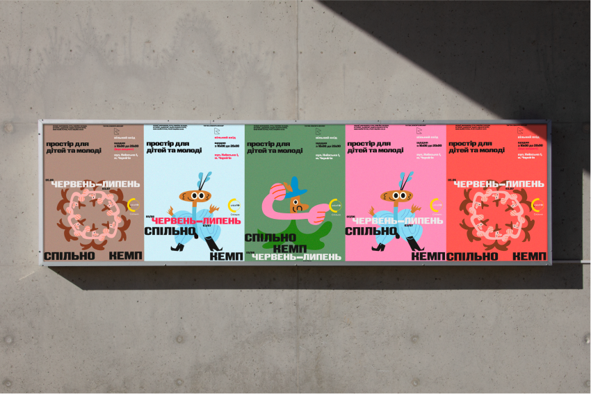
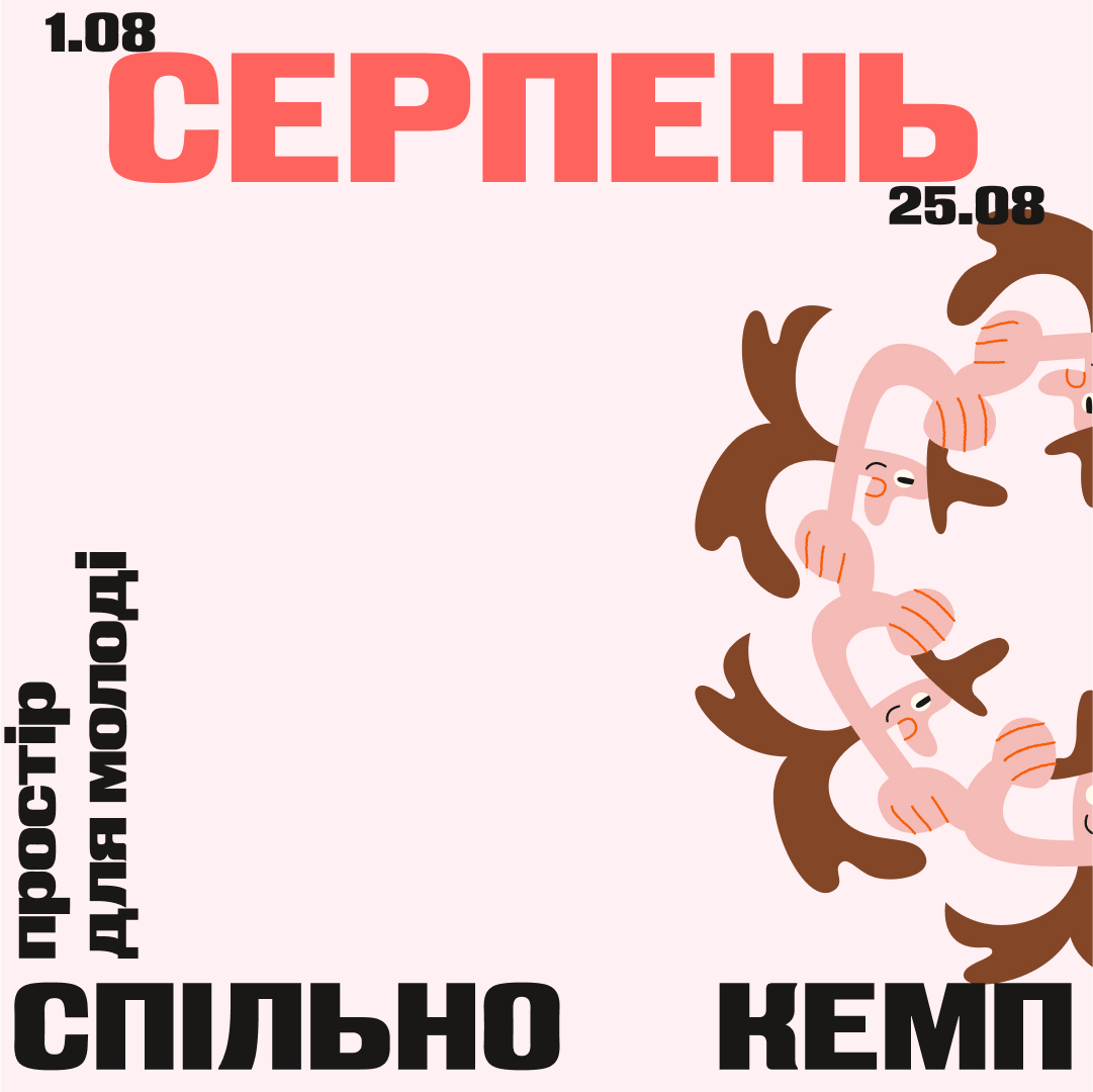
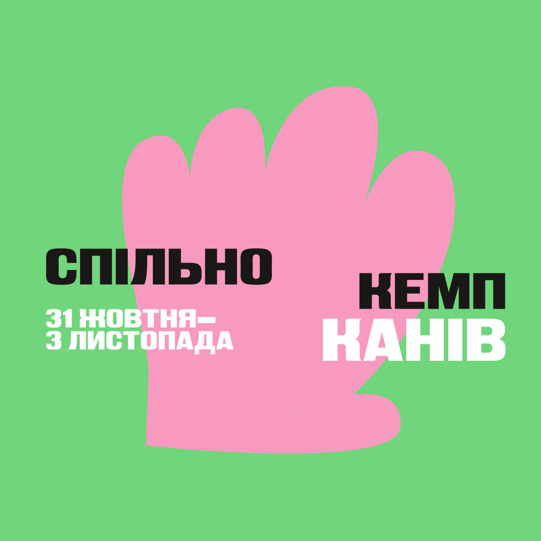
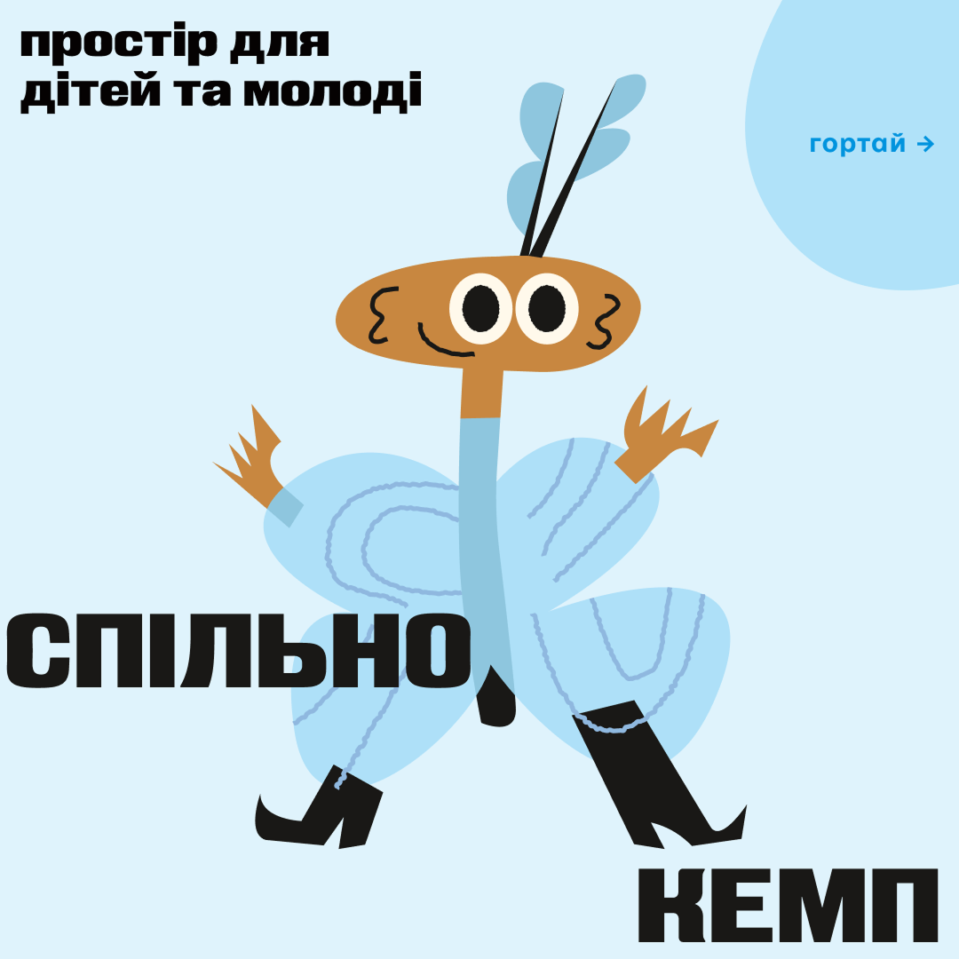
For this project, I combined international style, modern Ukrainian typography, and Japanese color harmony with the classic grid to organize and structure the children's chaotic energy. We ventured into uncharted territory by creating our own combinations and experimenting with multiple grids. The primary color harmony and illustrations feature bright and bold colors, while a complementary pastel palette harmonizes the layouts with the environment. We focused on pushing boundaries and fostering creativity. We developed a vibrant visual language with the children, aligning with our mission of making learning accessible and transforming mistakes into learning experiences.Our approach evolved over time, drawing inspiration from the children's energetic nature, creativity, and fast-paced thinking.
Solution
Learning experience instead of mistakes.
To scale the design system, I created templates for non-designers using children's and “childish” artwork. I reframed "mistakes" as "learning experiences" and developed a modular system for easy content addition. Now, the design system operates independently.
To scale the design system, I created templates for non-designers using children's and “childish” artwork. I reframed "mistakes" as "learning experiences" and developed a modular system for easy content addition. Now, the design system operates independently.
Output list
1. Web Design;
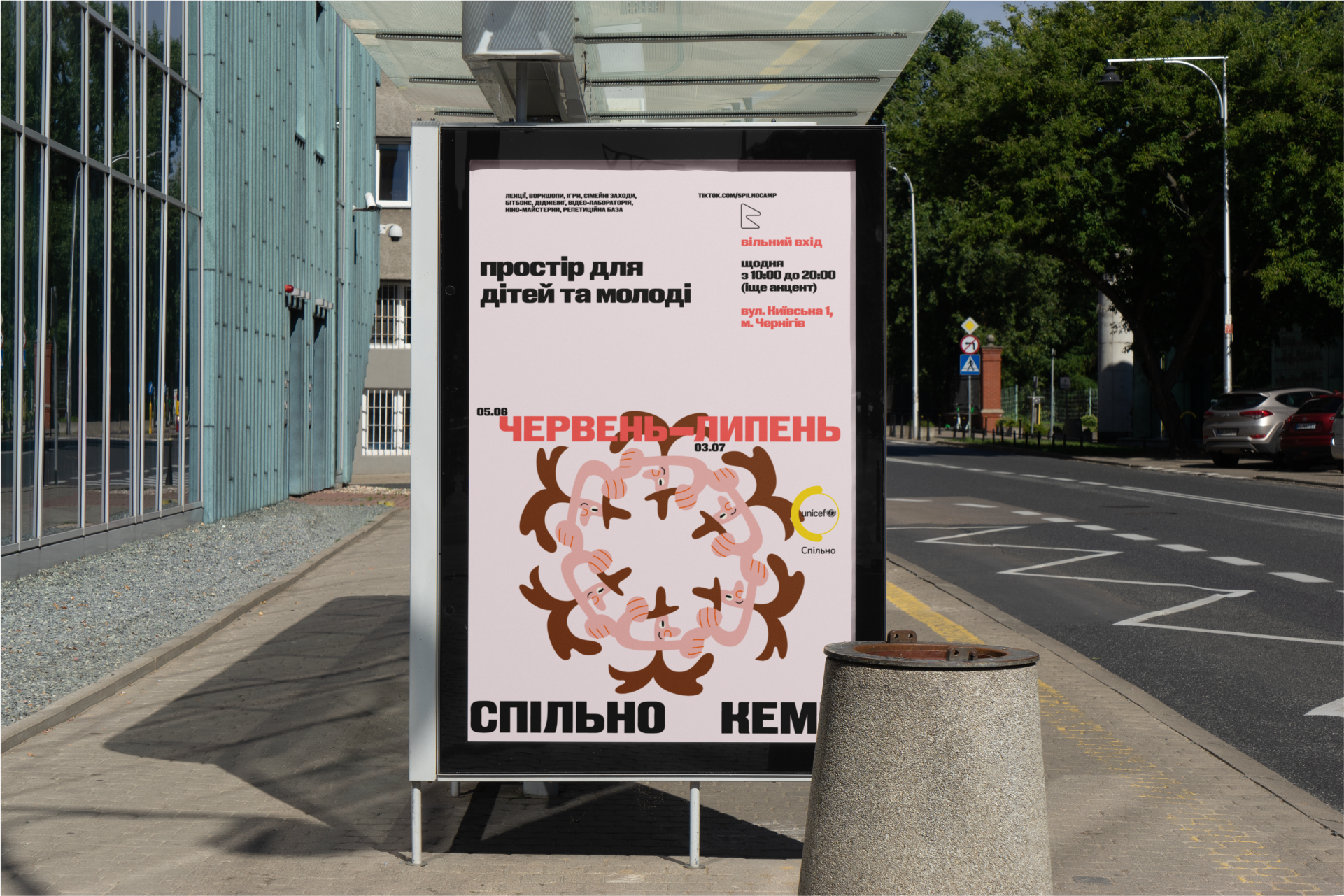
2. Outdoor advertising (posters, city lights, boards, banners, vehicles);
3. Social media layouts;
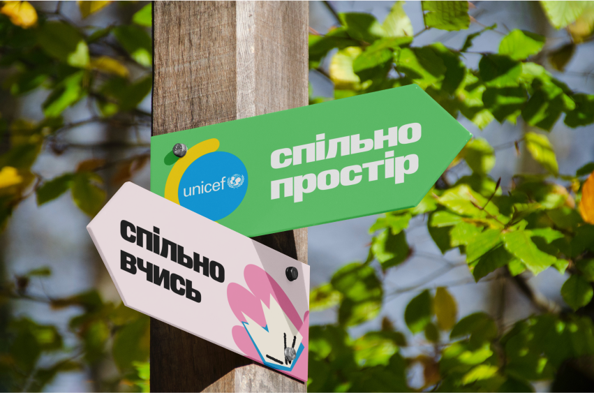
4. Navigation design;
5. Environmental elements;
6. Interior elements;
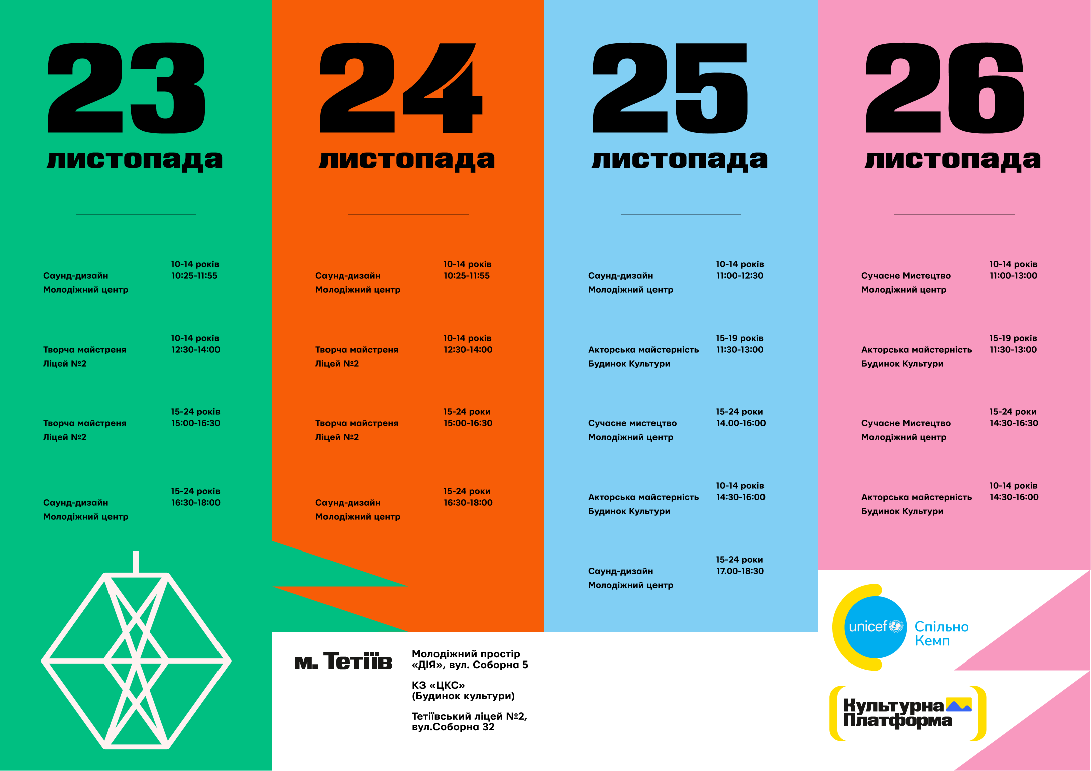
6. Workshops for children aged 13-19;
7. Style guide;
8. Convenient environment and templates for the event team;
9. Toys, interactive games;
2. Outdoor advertising (posters, city lights, boards, banners, vehicles);
3. Social media layouts;
4. Navigation design;
5. Environmental elements;
6. Interior elements;
6. Workshops for children aged 13-19;
7. Style guide;
8. Convenient environment and templates for the event team;
9. Toys, interactive games;
My role
As an educator
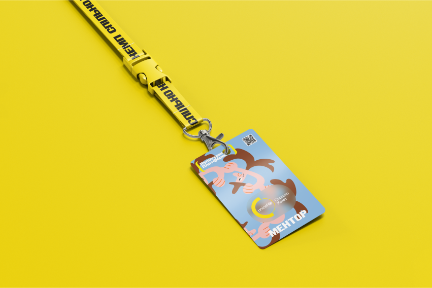
As a mentor at "Спільно Кемп" for 13-19 year olds, I taught design basics with a focus on imagemaking.
Together with the campers, we produced over 500 creative images and delved deep into the world of visual storytelling.
I am proud to have adapted the excellent CalArts module to the Ukrainian context, incorporating methods used in international schools.
Together with the campers, we produced over 500 creative images and delved deep into the world of visual storytelling.
I am proud to have adapted the excellent CalArts module to the Ukrainian context, incorporating methods used in international schools.
As a designer
As a designer, I looked for ways to make the design system consistent and explore ways to use children's creativity in the digital world. I've learned a lot from them and from keeping an open mind.
Process
- Research. During my travels to Ukrainian communities, I studied the visual aspects of various villages and cities, including ethnographic elements and local aesthetics. Along the way, I created a sort of anthropological and design journal where I gathered cultural artifacts from different cities.
- Working with kids. Also, a significant part of the work process involved the educational process and working with the results of master classes, from which I have an archive of 500+ works.
- Adapting international programs to the Ukrainian context involved implementing UNICEF's visual systems. This was one of the regular activities I dedicated a specific slot to in the design process. This part of the work required close collaboration with team members including operations managers, scriptwriters, video editors, and psychologists.
- Design and testing. In order to address the challenges, it was a priority to quickly design layouts and implement them. To streamline the process, I made sure that the design and testing phases were closely linked. Each week, the team created numerous handouts for various events in different communities, so the main focus was to consolidate the different requests into a single content system. Additionally, I provided the team with several scripts to automate the production of a weekly or monthly content plan.
Feedback
Andrii, your stuff taught me a lot of things. I'm all about the lectures in the tent. The process you show sprouted in my life. Now I do not afraid to learn something new, it's like a blocked things go away, an understanding that you can learn anything you want. Nothing bad will happen to you if you just try.
My mum, for example, is very afraid to try something, and all her life she wanted to learn to play the guitar, but it always seemed to be out of time. Although to learn how to play the guitar you just need to pick up a guitar and play, constantly improvising, you will understand how it works and start feeling the sounds with your hands.
My mum, for example, is very afraid to try something, and all her life she wanted to learn to play the guitar, but it always seemed to be out of time. Although to learn how to play the guitar you just need to pick up a guitar and play, constantly improvising, you will understand how it works and start feeling the sounds with your hands.
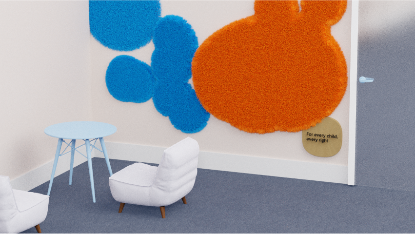
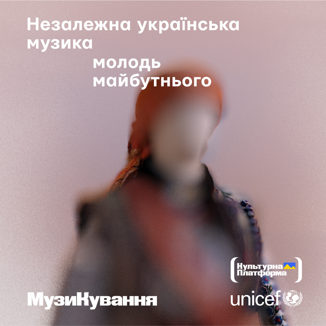


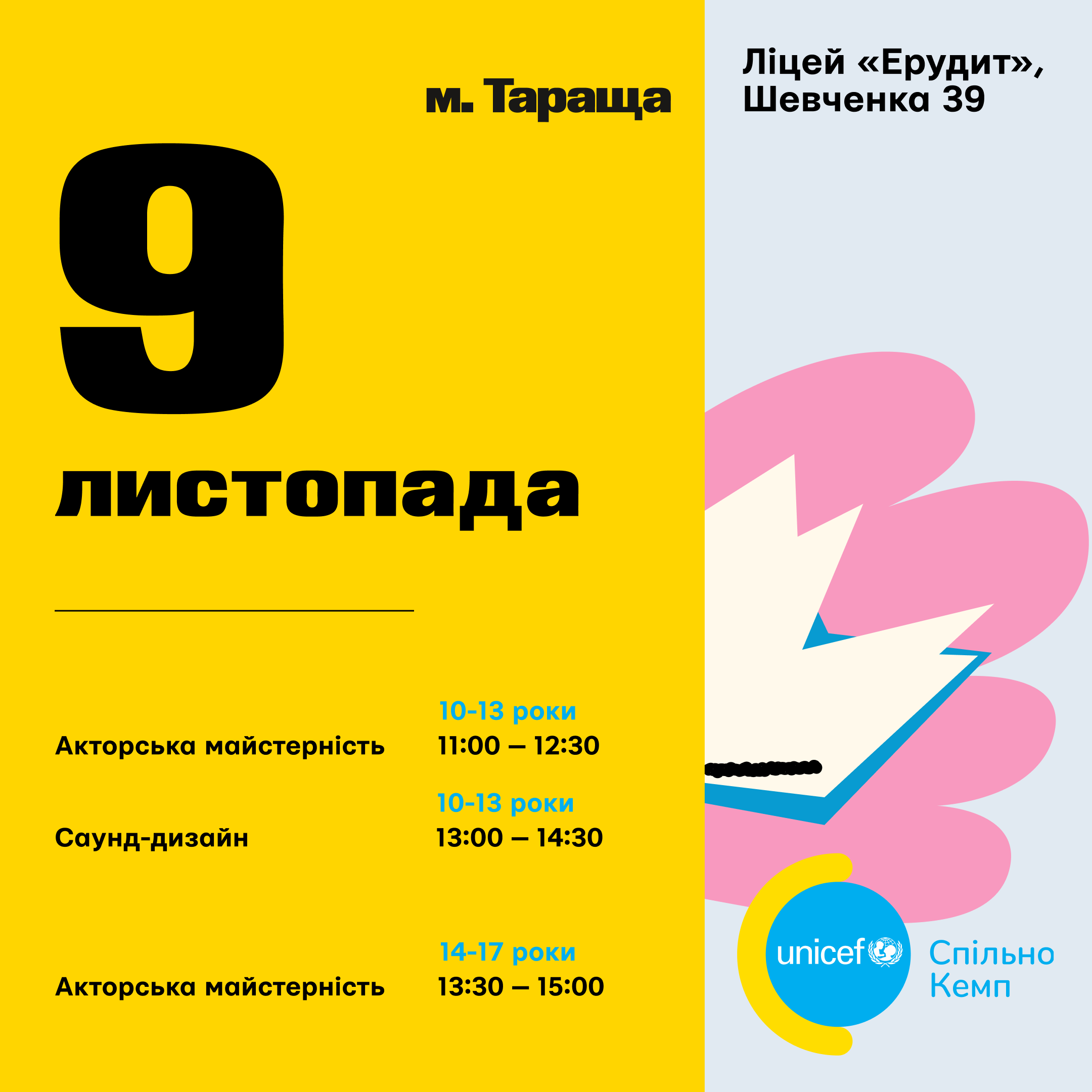
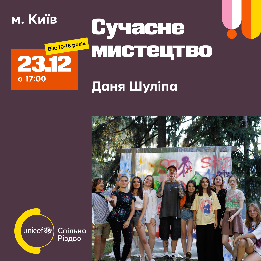
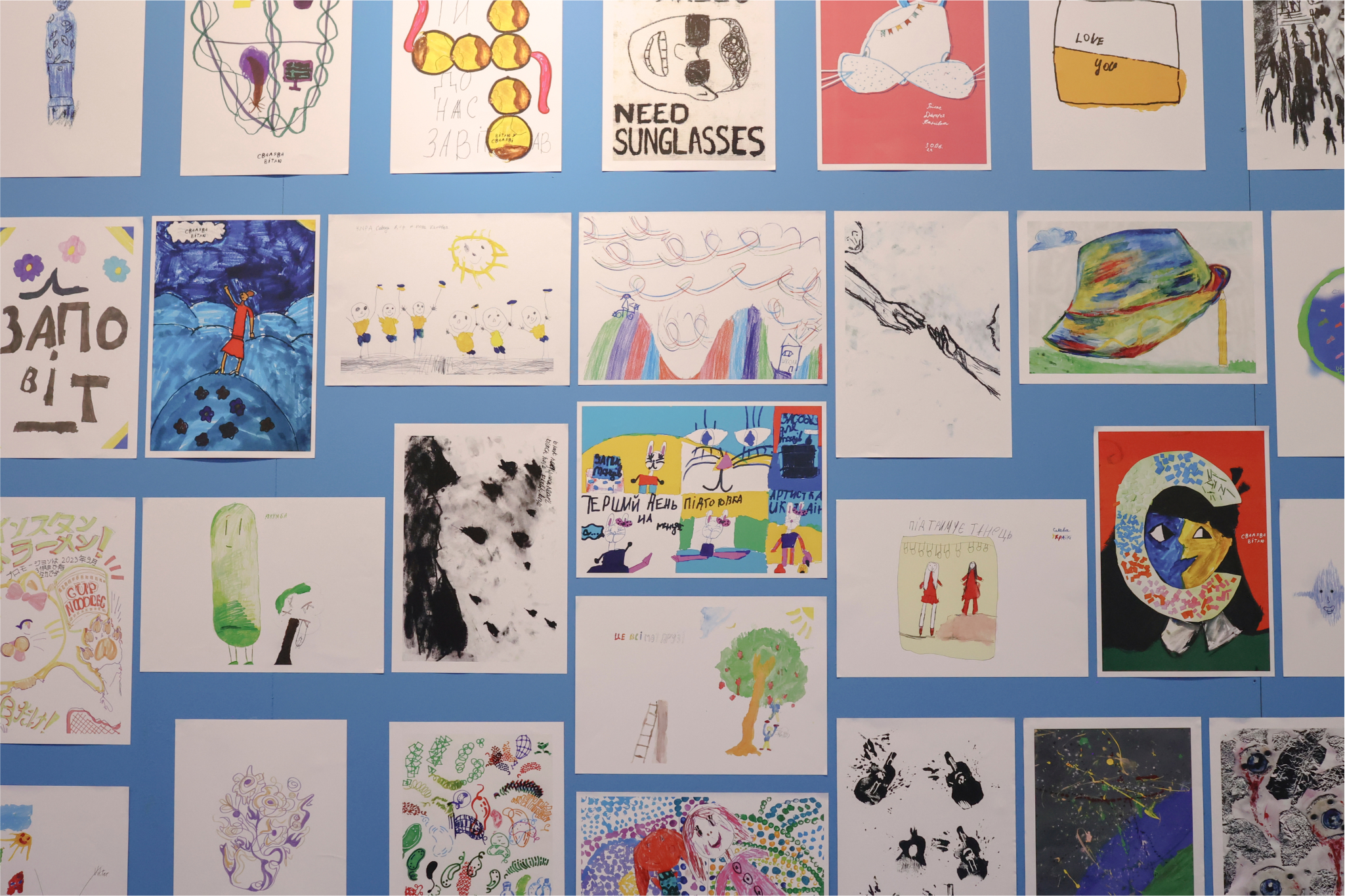
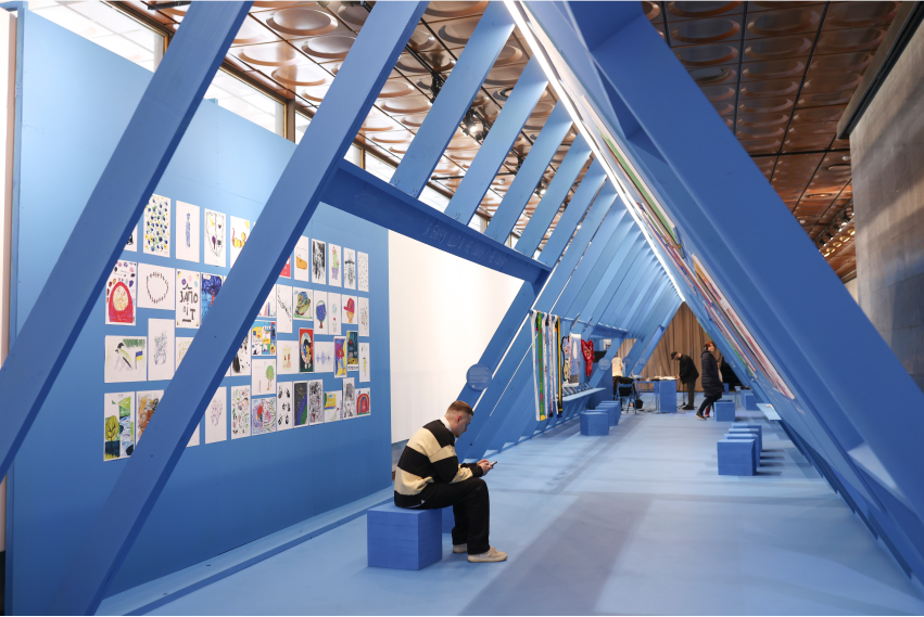
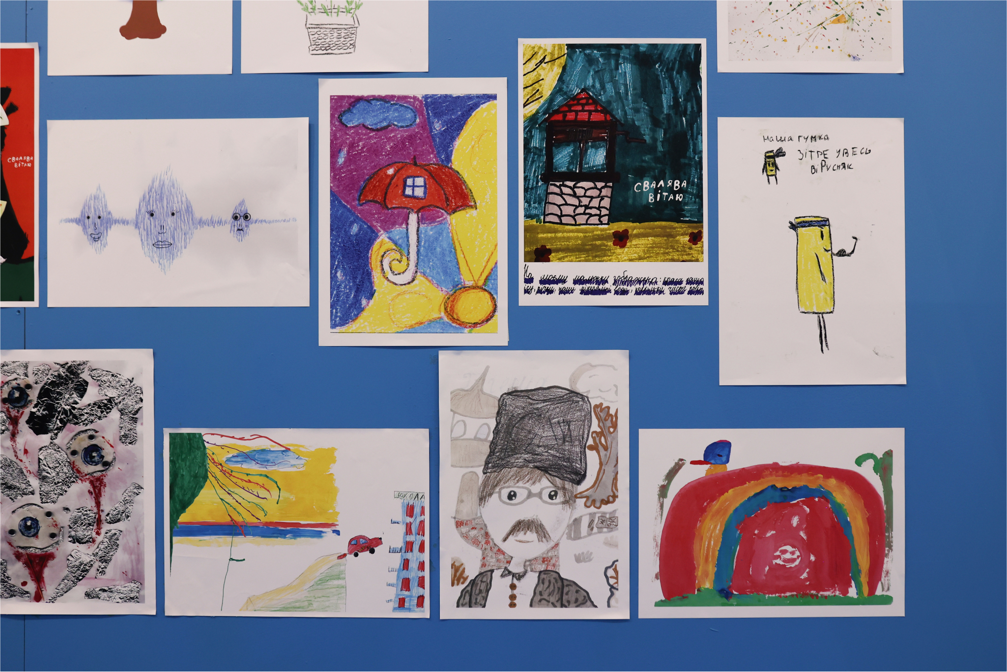
To mark two years since the escalation of the war, UNICEF organised an exhibit in Kyiv featuring artworks by children, created in collaboration with Ukrainian artists. It's a space filled with children's thoughts, voices, emotions, and dreams—a beacon of hope amid war.
https://x.com/UNICEF_UA/...
This cute video from a local kids' TV channel is in Ukrainian. Turn on subtitles if you want to understand what is happening.